My Design Process
When a customer makes contact for a job, the first step is to figure out what it is they really want. Often, they may only know that they "want a webpage." Sometimes, that comes with a list of specific requirements. Much more often, it doesn't. It's my job to ask questions which get to the heart of the matter: who's going to be using this page or site? Why are they coming to this page? (Or why do you hope they're coming to this page?) What are the top tasks they'll be looking to complete once they find the page? Sometimes, the client knows the answers right off the bat, but usually this is the first time they've thought about it in the kind of detail that I need. That's fine because part of my job as the designer is to guide them through that thinking process.
Competitive Analysis and Ideation Phase
Once I feel that I have sufficiently clear answers to these questions, I'm ready to start my own ideation sessions. This is a solo activity that takes place between me and a piece of paper. I'll start by doing some competitive analysis. I'll review websites that have a similar mission to look for ideas and see who stands out among the crowd. Who's doing it best? What can I learn from their example? In this example, my task was to design a series of web pages that describe support for six different scientific programs at an x-ray facility. Shown below are my sketches of two competitor facilities (top) followed by initial ideas for my own solution.

I had more ideas, too. As I explored them, I had a "conversation" with myself as to what the pros and cons of different ideas were. Sometimes, writing these thoughts out makes the answer obvious. I can discard obvious dead alleys and keep ideas that seem to make sense.
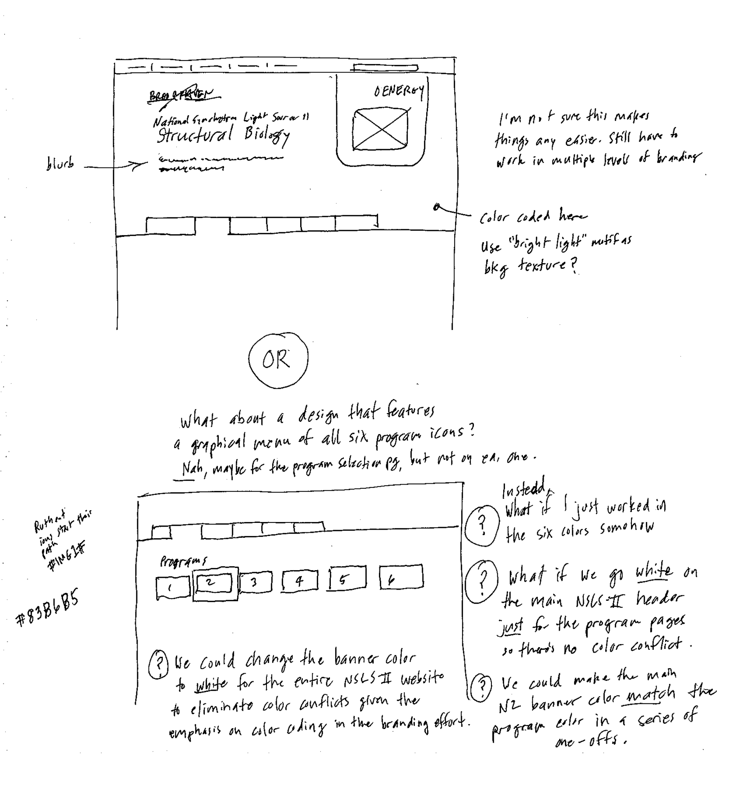
This following page contains a list of what each program page must contain. No matter what I come up with, the design template must accommodate these requirements. In this case, I was working with a graphic arts colleague who had already designed branding elements for use in print collateral. I had to incorporate the background images and color coding selected by the graphic artist, each specific to a particular program.

HTML Mockups
At this point, I have my benchmarking review and my requirements in hand as well as some preliminary sketches. Now, it's time to move to the screen. Sometimes, I'll use a mockup tool like Balsamiq and sometimes I'll move straight to building a basic page in an HTML design tool like Expression Web. Here, I'm trying to find a way to work in the required branding elements, an icon and its specific color palette. Neither of these two options felt right; they seemed clumsy. It's in keeping with my motto: the first design is rarely (if ever) the best design.
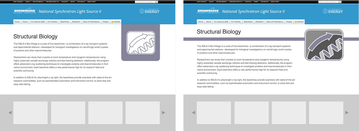
I decided to pursue an alternate design that I generated during my sketching and ideation phase. It managed to incorporate the background images used in the print collateral, the program icons, and the color palette specified by the graphic designer. These are the first two working prototypes. The first shows the solution for placing the background image and icon using a 3D shadow effect below the standardized blue page header. The second shows a refinement of the design in which I began adding required elements like slogans, contact names, and links to related pages.

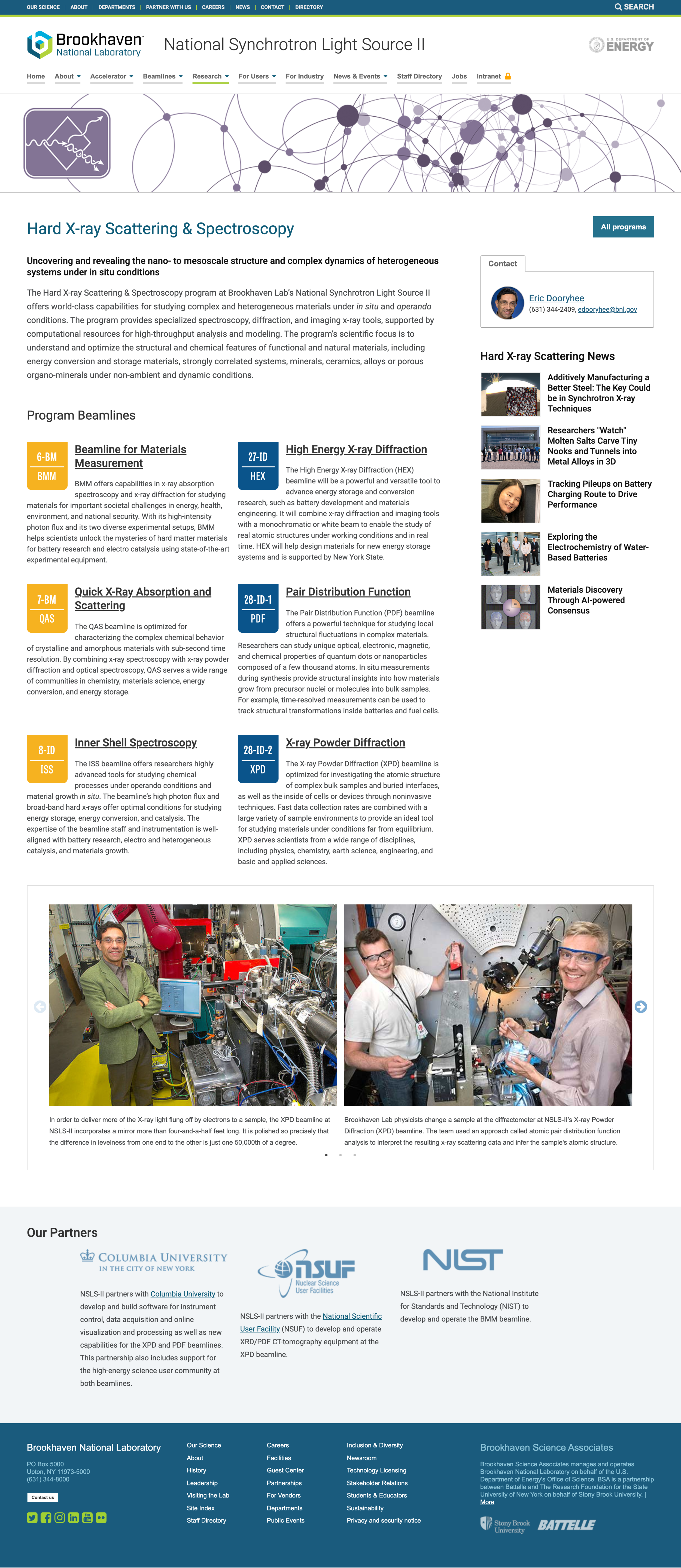
Final Product
After further discussion with the client and additional refinements, I have arrived at the final product. I'm now ready to conduct user testing to see if the design facilitates task completion as well as we hope. If it does, we can launch. If it doesn't, I'll be making further modifications to address deficiencies.

2021 Update!
The organization underwent an extensive rebranding in 2021 and the page received the following facelift. The header area got a lighter appearance with less visual density.